Good news: you don’t need to be a professional interior designer to create a beautiful home! You just need to understand a few interior design basics.
If you’re anything like me, your first attempt at interior decorating was probably a bit disheartening. You had a clear vision and picked out different elements you thought would look great together, but somehow the finished room just didn’t feel “right.”
You can buy the most gorgeous pieces of furniture, but if you don’t follow the basic principles of interior design, your room won’t hang together. If you want to design a room with real visual appeal, you’re going to need to learn the basics of interior design.
But don’t worry! These concepts aren’t complicated. And once you’ve understood them, you’ll be able to apply them to any home design or interior decorating project.
In this post, I’m going to break down the most important fundamentals of interior design into ten simple concepts. With these home decorating basics in your pocket, you’ll be able to design rooms that just feel “right.”
So, let’s dive into the basic interior design rules everyone needs to know!
10 Interior Design Basics
These are the ten interior design rules I come back to in every project, whether I’m styling a simple vignette or transforming a large room.
1. Balance
Balance is one of the most important basic interior design principles. It’s about creating a sense of stability by distributing the visual weight evenly. This makes the room feel cohesive and calm.
Think of balance like a see-saw. If one side feels heavier or busier, the whole space feels off.
There are different kinds of balance, and the type of balance you use can really change the feel of a room.
If you want to create a more traditional or formal look, use symmetrical balance. You might have identical chairs on either side of a fireplace, for example.
For a more relaxed or modern look, use asymmetrical balance. This is where you balance the two sides using different objects that carry the same visual weight. For example, on one side of the fireplace, you might have a large armchair. On the other side, you might balance the chair with a tall plant and a lamp.
Visual weight isn’t just about size. It includes color, texture, and height. A dark cupboard may feel heavier than a light one, even if they’re the same size.
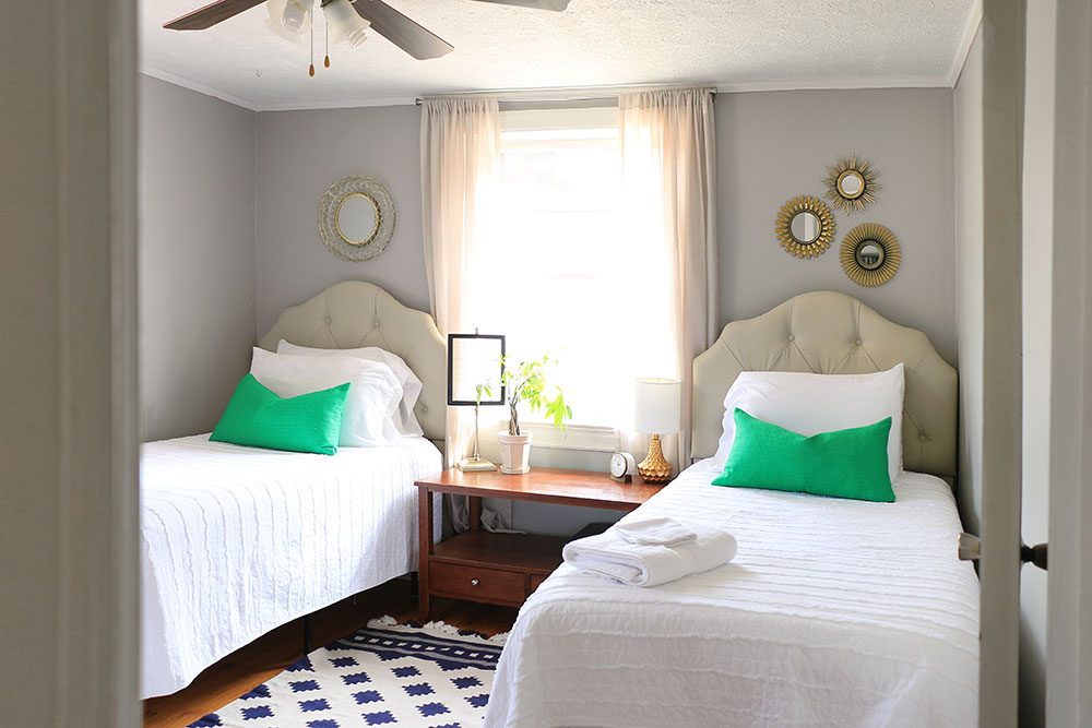
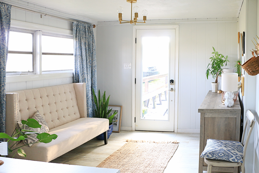
The twin bedroom in my Airbnb is a good example of both types of balance. The two beds, headboards, and pillows are identical (symmetry), but the mirrors above them are asymmetrical: three small ones on one side, one large one on the other. Different, but visually balanced.
Tip: Take a black-and-white photo of your room. If one side looks darker, you know you need to adjust!
2. Emphasis
Emphasis is all about choosing a focal point – something your eye is naturally drawn to when you walk into a room. Without this key factor, everything competes for attention, which can make the space feel chaotic.
A natural focal point for a room might be a fireplace, a bold piece of artwork, a dramatic headboard, or large cabinet, or a piano.
Once you’ve picked your focal point, draw attention to it. Don’t clutter the space with too many competing elements.
Instead, use furniture arrangement and lighting to draw the eye to it. For example, you might add a picture light above a painting or arrange your furniture to face the fireplace.
You’ll usually have one main focal point in the room, but you can also create mini focal points within smaller areas, like on a bookshelf, coffee table, or vignette.
In one corner of my she shed, the easel is the clear focal point.
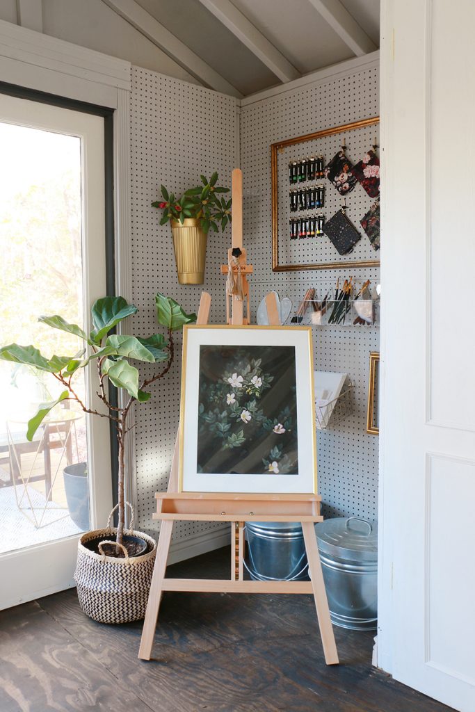
See how everything else in that corner frames the easel, and how I’ve used color to guide the eye? The light walls and ceiling, the golds and browns around the easel, and the white border around the dark artwork all work together to emphasize the center.
3. Contrast
Perhaps the most important of the interior design basics, contrast is essential to interior design because it adds visual interest. Without it, a room can feel flat or overly matchy.
Contrast is all about mixing opposites. Here are some examples:
- Light and dark colors
- Smooth and rough textures
- Plain and patterned surfaces
- Straight and curved edges or shapes
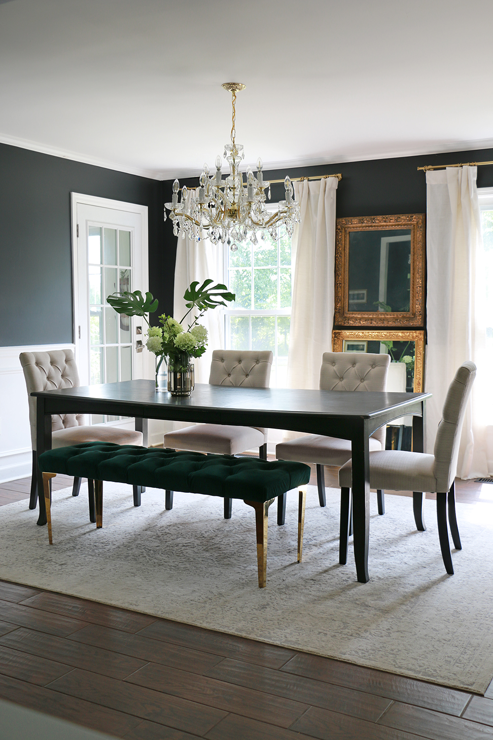
One of my favorite ways to use contrast is by pairing dark blue paint with white, like in our dining room.
4. Color Theory
Understanding basic color theory is one of the easiest ways to start making better decorating choices. Let’s go through three basics of color theory.
1. The 60-30-10 Rule
If you take just one thing away from this post, let it be the 60-30-10 rule. This rule states that:
- 60% of the room should use the main color (walls, large furniture)
- 30% of the room should use the secondary color (rugs, curtains)
- 10% of the room should use the accent color (cushions, decor)
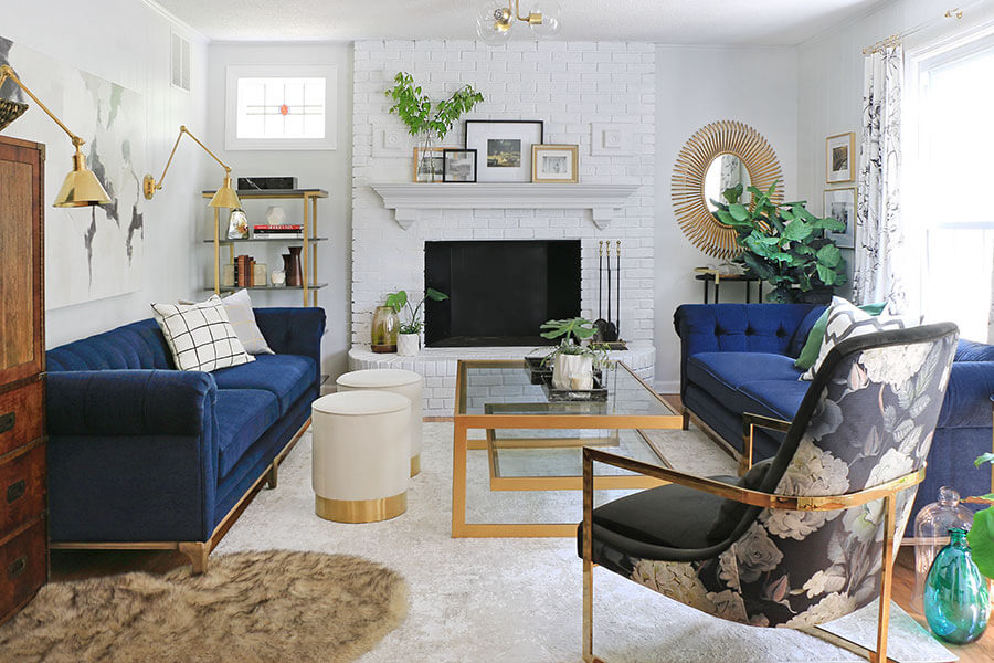
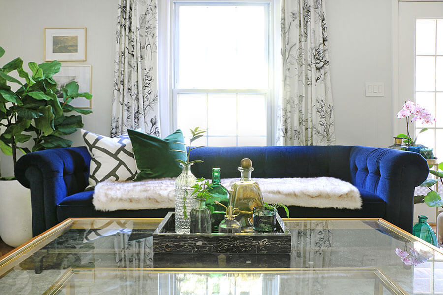
You can see this in action in my formal family room:
2. The Color Wheel
To decide which colors to use in your color scheme, familiarize yourself with the color wheel.
Then, if you want your room to be bold or dramatic, choose complementary colors – colors that are opposite each other on the color wheel, like blue and orange. (See the photo of my dining room above.)
Or, if you want your room to feel kind of serene and peaceful, choose analogous colors – colors that are next to each other on the wheel, like green and blue.
3. Warm and Cool Tones
All colors have underlying tones that are either warm (think red) or cool (think blue). Using warm tones creates a cozy, homely vibe. Using cool tones creates a calm, fresh feel.
Stick to either warm or cool tones for your walls and other large elements. Then, for a bit of balance and visual interest, you can add in a few smaller pieces in the opposite tone.
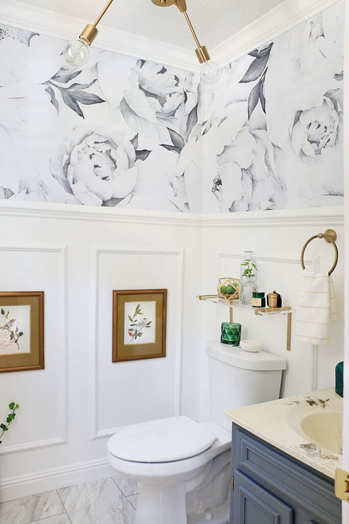
My powder room is a good example. The walls and floor are a crisp white (cool), but the gold accents add some warmth.
5. Unity & Harmony
While you don’t want every room in your home to look the same, it should feel like they belong together.
To create this unity, you need to use some of the same colors and other design elements to tie the rooms together. There should be some kind of cohesive theme that connects the different rooms.
You could:
- Use a consistent color palette throughout your home, but use it differently in each room.
- Repeat design elements like the same types of wood, mental finishes, or patterns.
- Give conjoining rooms at least one shared element, so it doesn’t feel jarring when you move from one to the other.
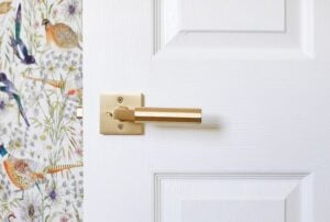
To create a sense of unity, I’ve used gold hardware throughout my entire home: door knobs, light fixtures, cabinet pulls, and so on.
I also use a lot of dark blue and white. In my dining rom, dark blue is the more dominant color. In other rooms, like the family room, white is the dominant color and blue is more of a secondary color.
My children’s rooms don’t contain the same dark blue. Instead, the whites are paired with their preferred colors, like pink and teal.

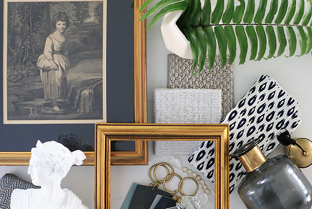
6. Texture
Texture brings depth and warmth to a space, especially in neutral or minimalist rooms. It’s all about how things feel – rough, smooth, soft, hard.
Try mixing:
- Soft textures like linen or velvet with hard ones like metal or wood
- Matte finishes with shiny ones, like ceramic vases, brass lamps, or glass accents
- Woven elements like baskets or rugs with sleek furniture
Don’t forget your walls and ceilings. Texture can come from paneling, wallpaper, or even just paint finishes.
When I helped design my parents’ California mountain home, we used earthy textures (wood, wicker, a natural fiber rug) to keep it cozy, then layered in shiny metal and glass to give it a more contemporary edge.
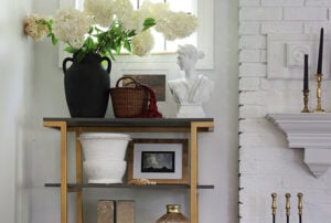
7. Scale & Proportion
Out of all the interior design basics, size is probably the easiest to understand. Scale and proportion are about choosing furniture and decor that fit your space, both visually and physically.
It’s not enough to love a piece or know that it matches your home decor style. If it’s the wrong size, it will make the whole room feel off. If it’s too big, the room will feel cramped. If it’s too small, the room will look unfinished.
When we moved house, I originally planned to reuse my Better Homes & Gardens Maddox Crossing Campaign desk in the entryway, but it was too small.
I swapped it for the Better Homes & Gardens Granary Modern Farmhouse Printers TV Cabinet, which fit much better in this particular area.
Scale isn’t just about furniture, either. Rugs should anchor the space, not float in the middle of the room, and artwork should be the right size and height for the wall.
Tip: Use painter’s tape or a 3D room planning app to mock up the size of furniture or art before buying.
8. Movement & Flow
Movement and flow are about making a room easy to move through. Obviously this is harder if you’re decorating a small room, but you just have to get creative.
Start by placing your biggest, most essential pieces of furniture down first (like a bed, sofa, or dining table), and then build around them.
Make sure it’s easy to walk from the doorway to the main part of the room, such as the bed or the sofa. Keep that pathway clear of obstacles and use area rugs and furniture to make the route clear. Stress test your furniture layout by walking the space.
It’s also worth thinking about what visitors will see when they first enter the room. Ideally, the room will feel open, not closed off by a large piece of furniture, for example.

9. Lighting
Lighting isn’t just about seeing where you’re going… It’s a key interior design element that sets the tone of a room. The best spaces have layers of light that can shift with the time of day or your mood.
Ideally, you want to give every room a few different light sources. Try to include:
- Overhead lighting to generally light up the room
- Task-specific lighting for doing certain activities (like reading or playing the piano)
- Accent lighting to add warmth and ambiance (like picture lights or sconces)

10. Pattern
Pattern brings personality and depth to a room, but it’s easy to go overboard. The key is to mix patterns thoughtfully so they don’t feel chaotic. Here are some quick tips for using pattern in your interior design:
- Vary the scale: Pair one large pattern (like a bold floral) with a medium geometric and a small stripe or dot.
- Keep to one color palette to tie everything together.
- Use patterns on easily-swappable items like cushions, curtains, or throws (rather than wallpaper or upholstery).
- Stick to a maximum of three patterns per room.
Time to Apply These Interior Design Basics…
It’s so much easier to design a beautiful home when you understand these basic interior design principles. With just a little bit of thought, you’ll be able to confidently choose design elements that work well together.
Remember, though, that these interior design concepts are just concepts. They’re not the be all and end all, so don’t feel like you need to follow them to the letter.
Decorating your home is about expressing yourself and creating a space that is yours. Let your intuition and creativity lead the way, and use these interior design rules as a shorthand or guide. Once again, it’s all about balance!
Like This? You’ll Love These!
Related Posts: How to accessorize kitchen worktops | How to style a bookcase | How to update a living room | Dining room wall decor ideas | Home decor thrifting tips | Decorating with wallpaper | Where to hang wall art | Ways to update furniture |

Leave a Reply